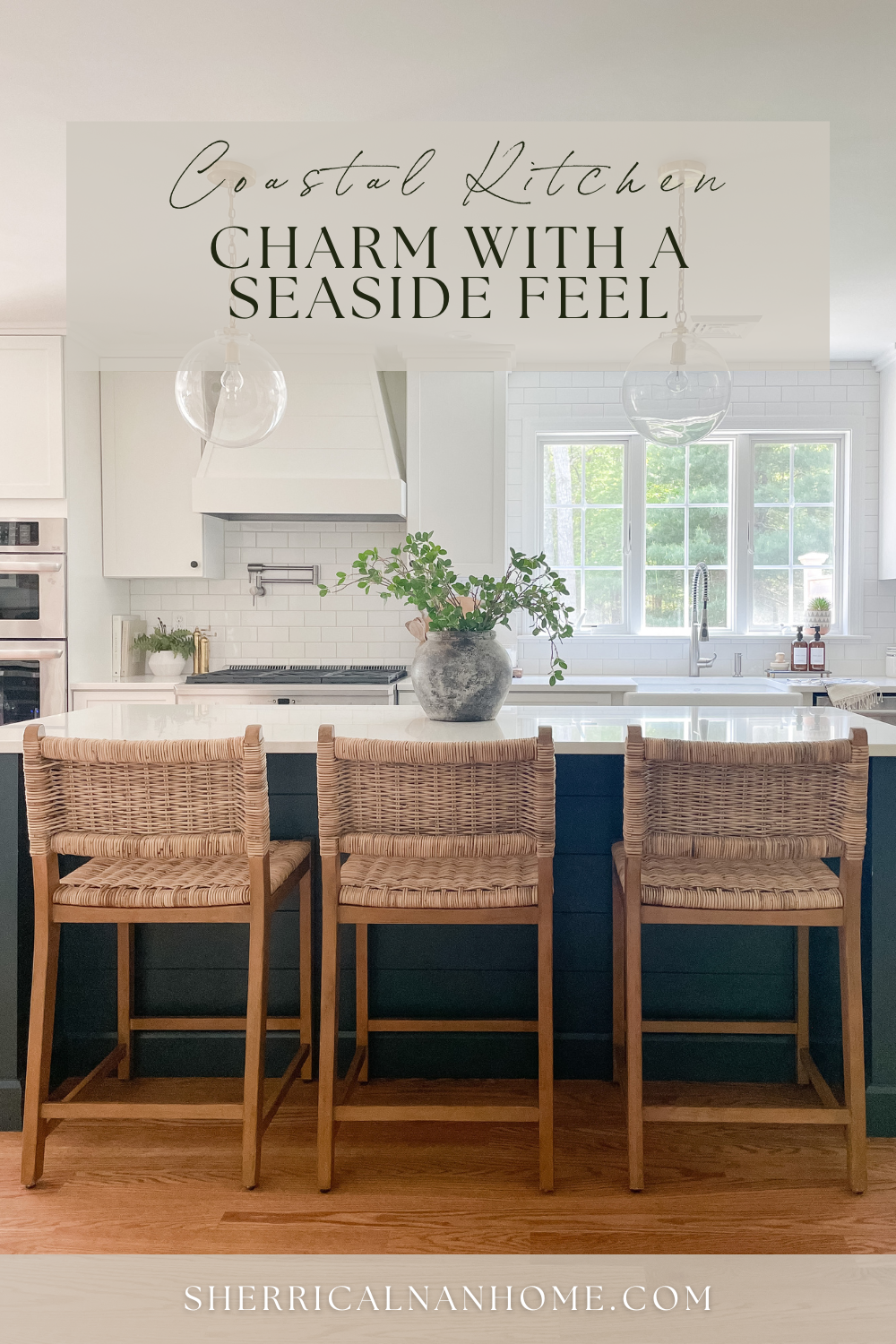
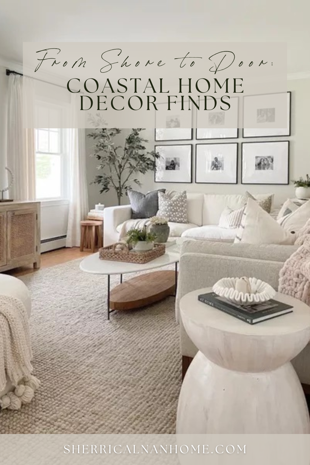
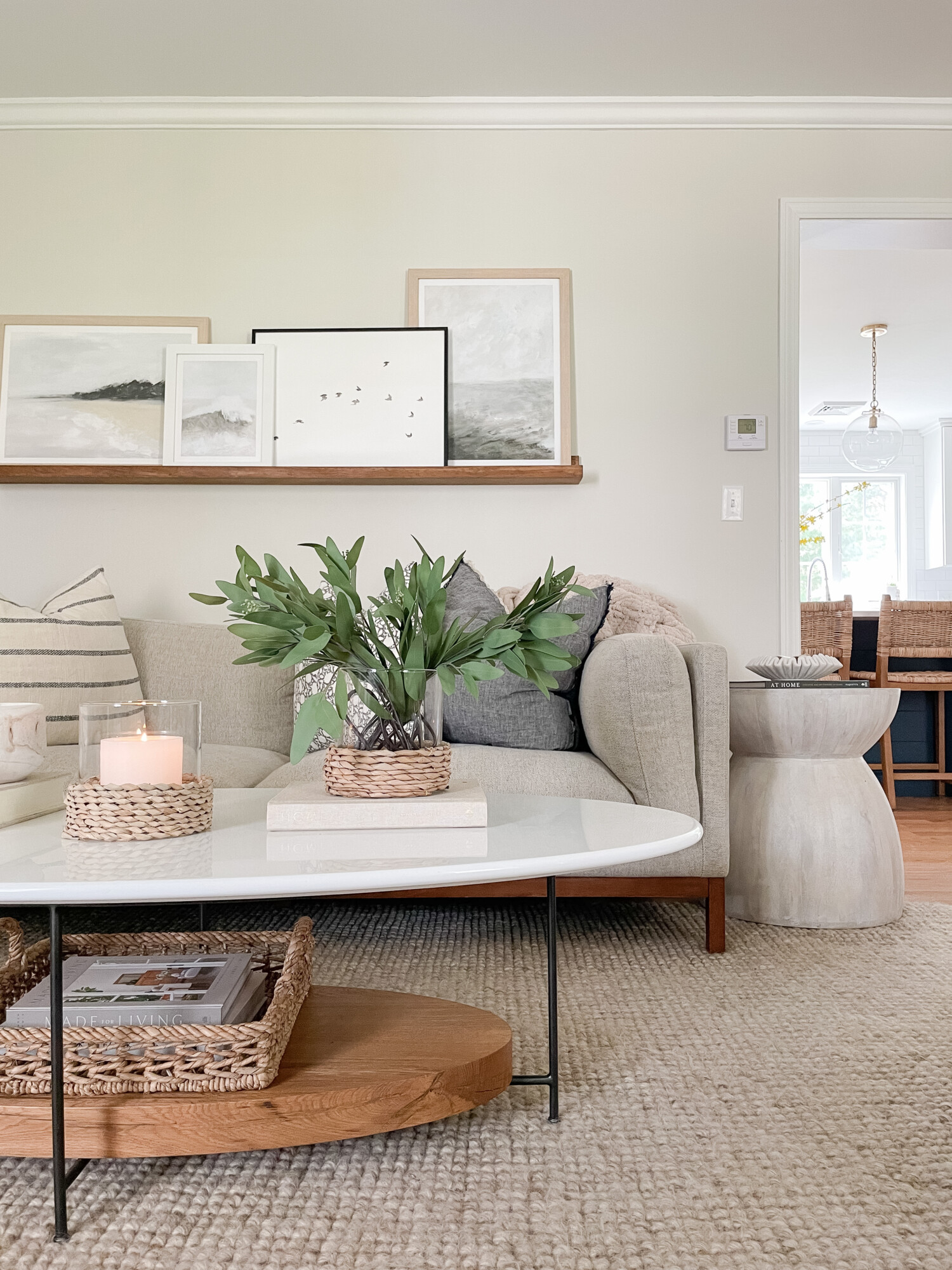
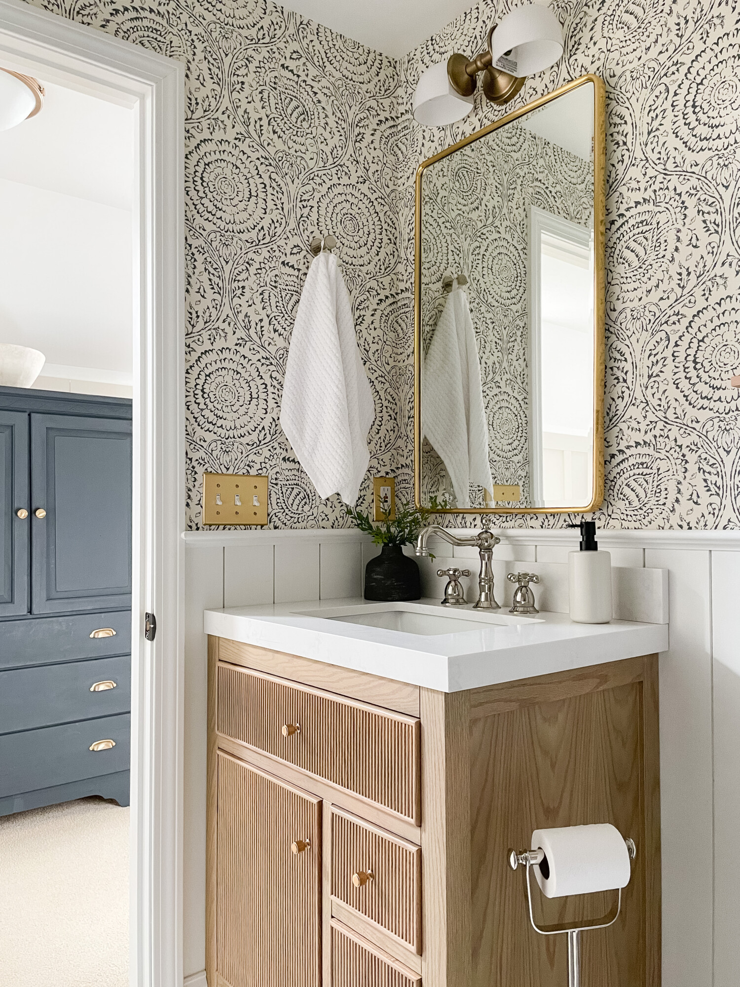
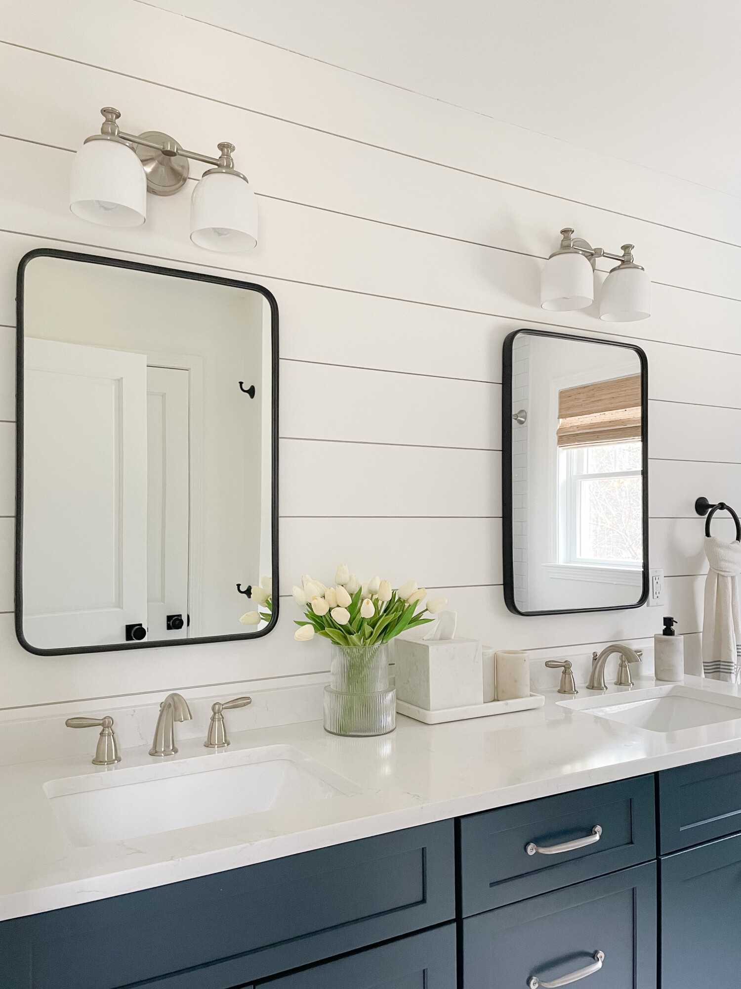
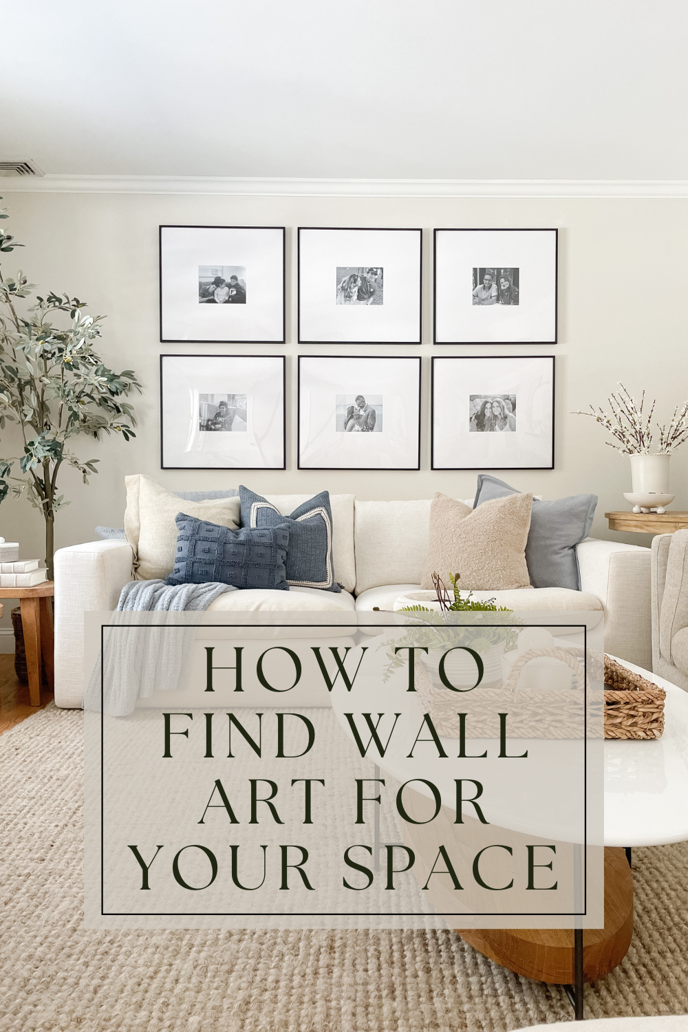
Get ready to bring the coastal vibes into your kitchen with these seaside decor and styling ideas! Similar to the ocean breeze, a coastal-themed kitchen can breathe a fresh and airy feel into your home. Although we may not live right by the beach, infusing coastal elements into our kitchen has been an exciting project. Keep scrolling to see our coastal kitchen finds!
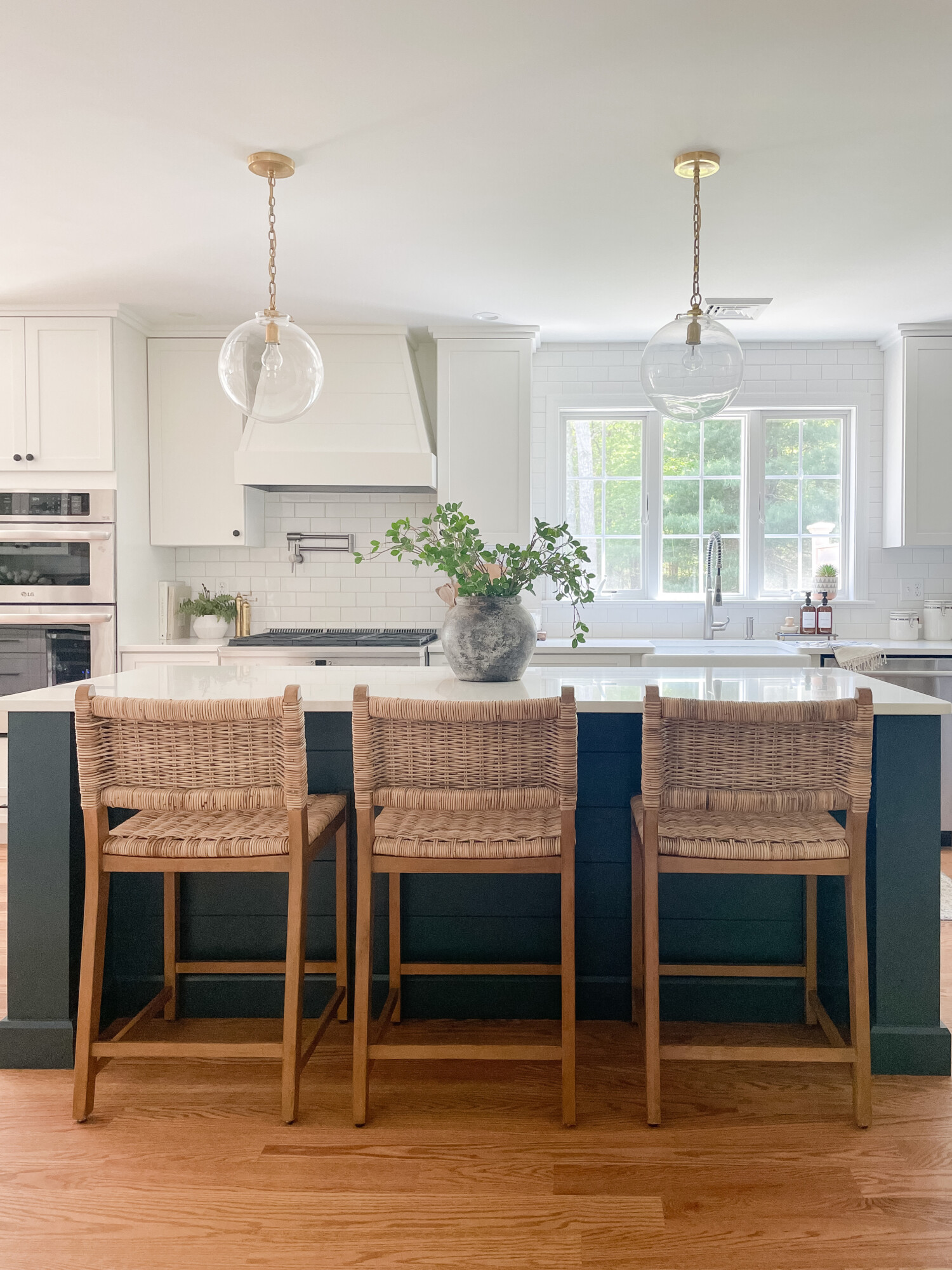
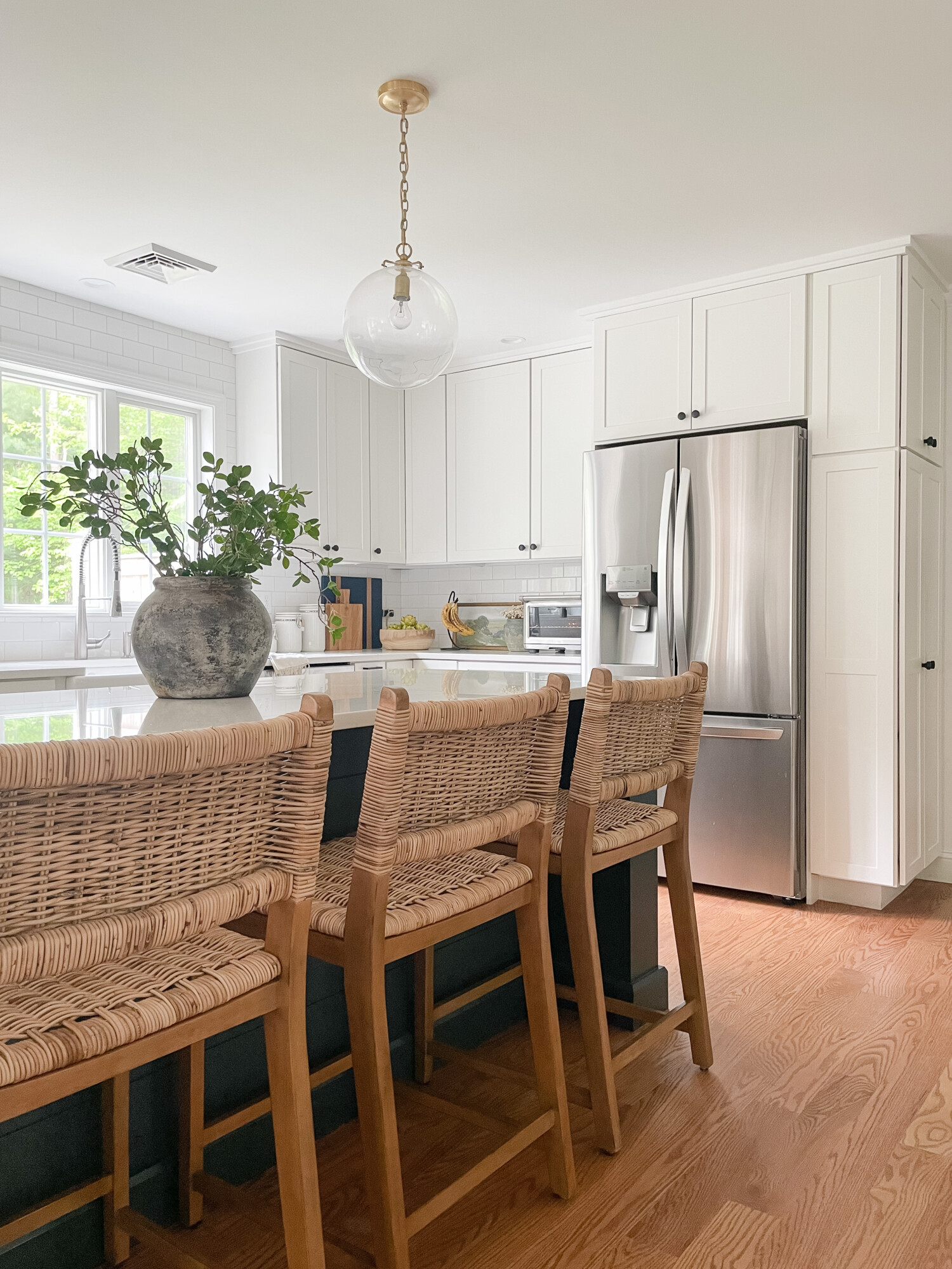
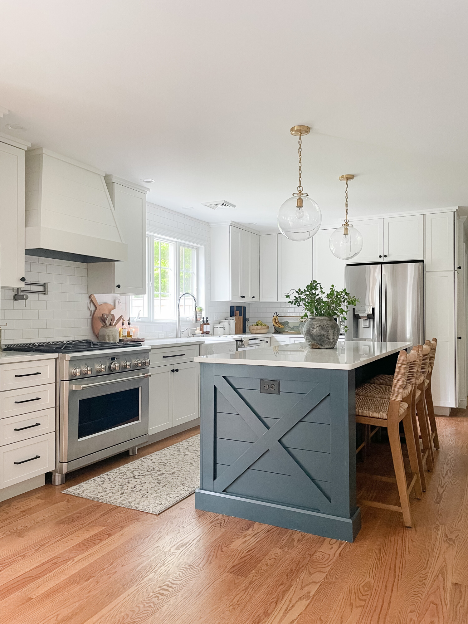
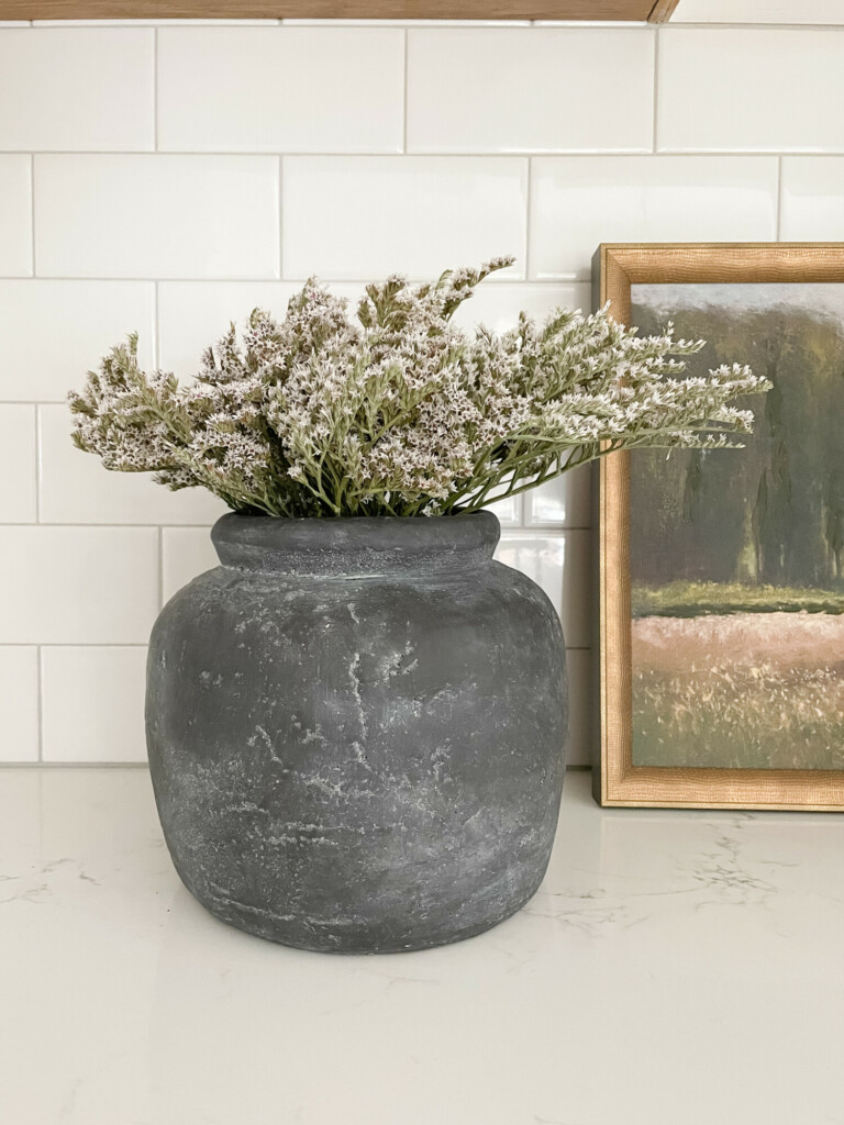
Stools | Glass Pendant Lighting | Salt & Pepper Mill | Vase | Faux Eucalyptus | Faux Fern
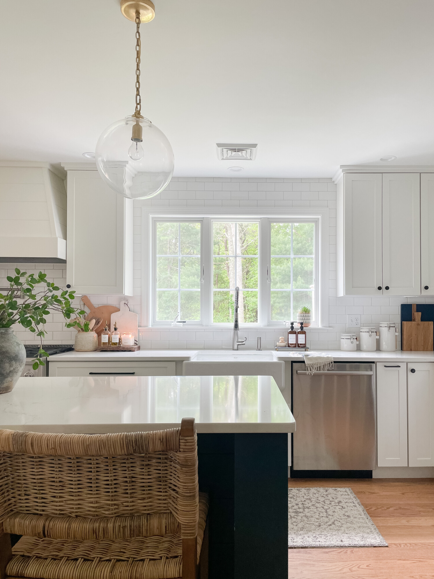
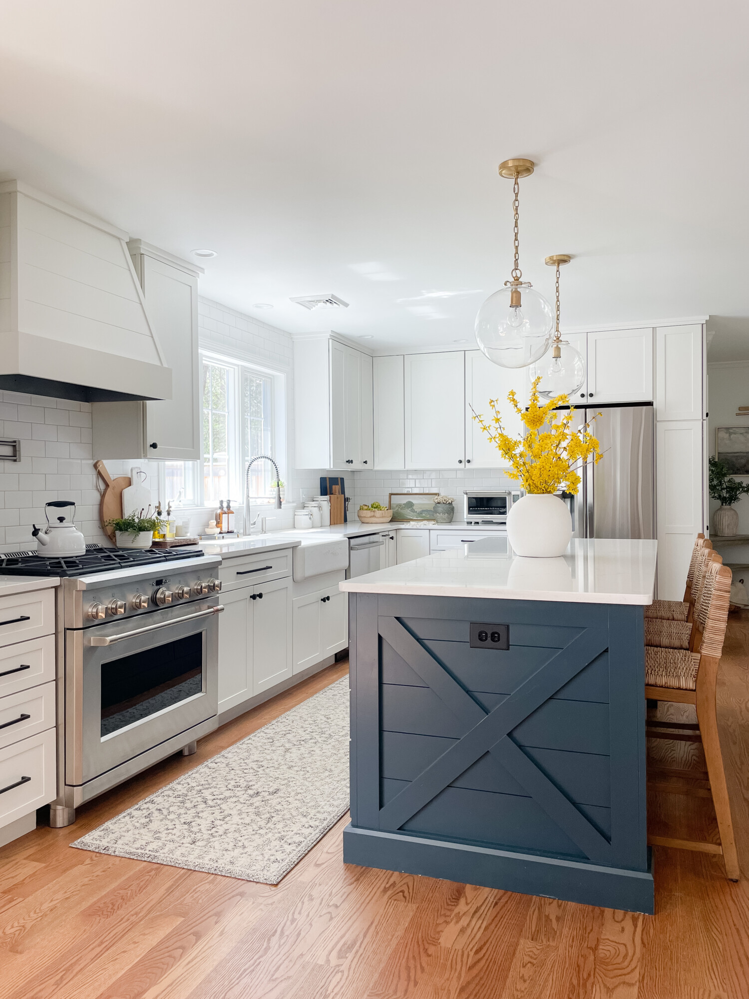
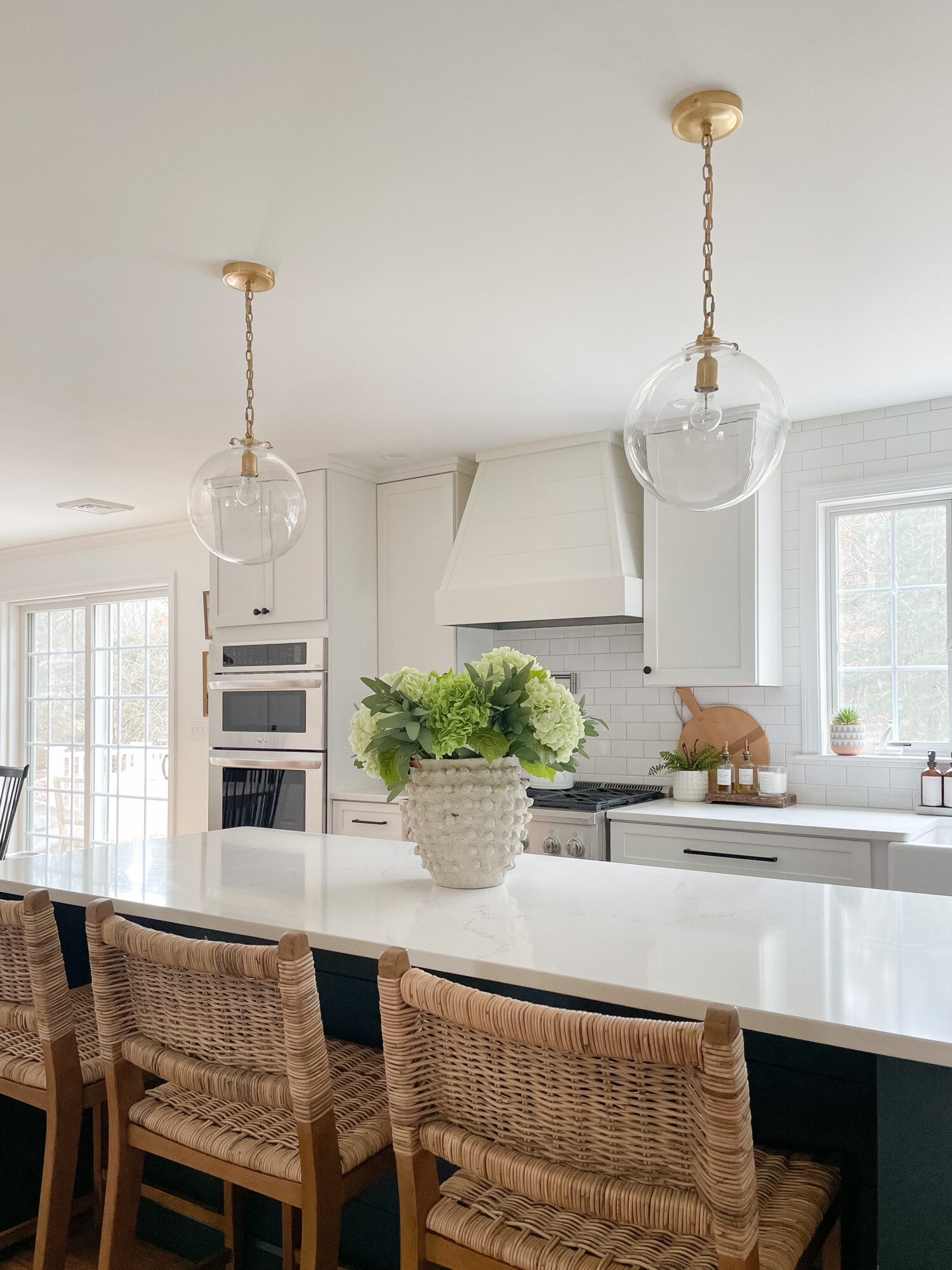
In our coastal kitchen, I aim to maintain an open and airy ambiance. We spend a lot of time as a family at this very kitchen island so I wanted to be sure it was a space that everyone could enjoy! These glass pendant lights are such a unique find and create such a warm and inviting glow. These white ceramic tiles make for a simple yet elevated backdrop, complementing any decor style! They are actually from Amazon, we chose ‘Arctic White’ and the Laticrete grout color is silver shadow.
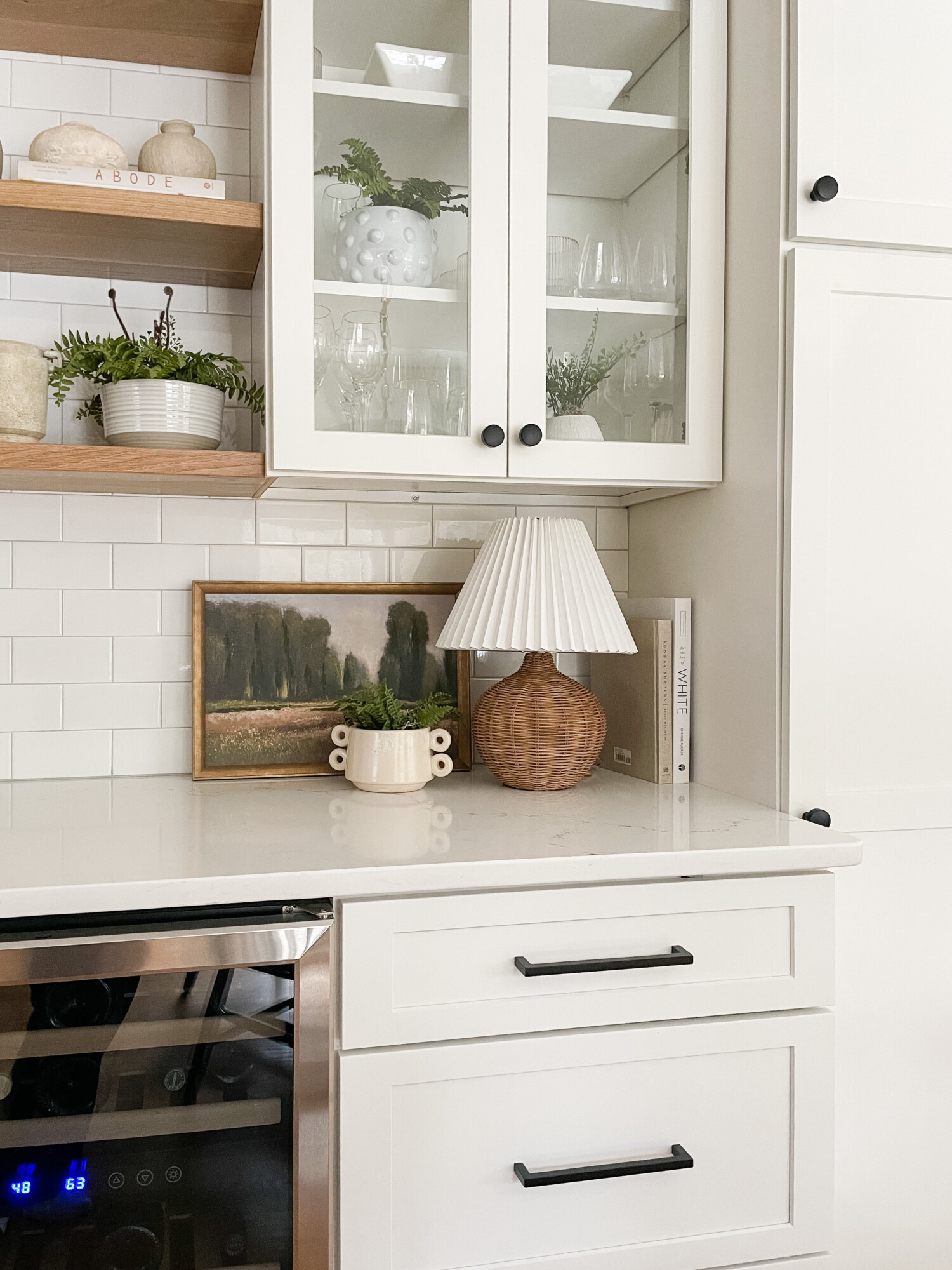
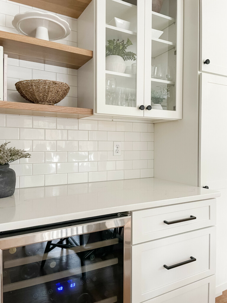
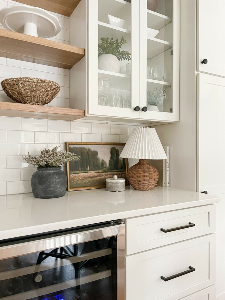
beverage nook
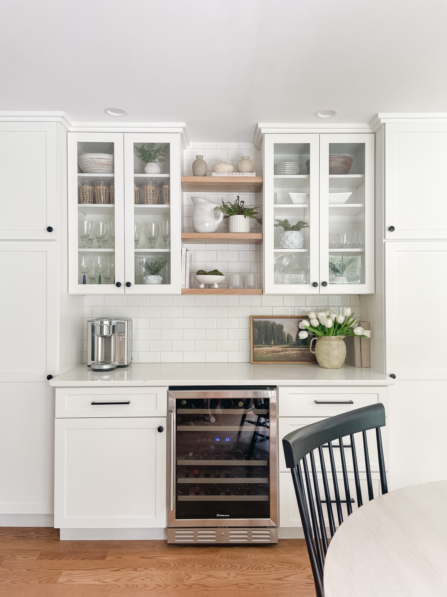
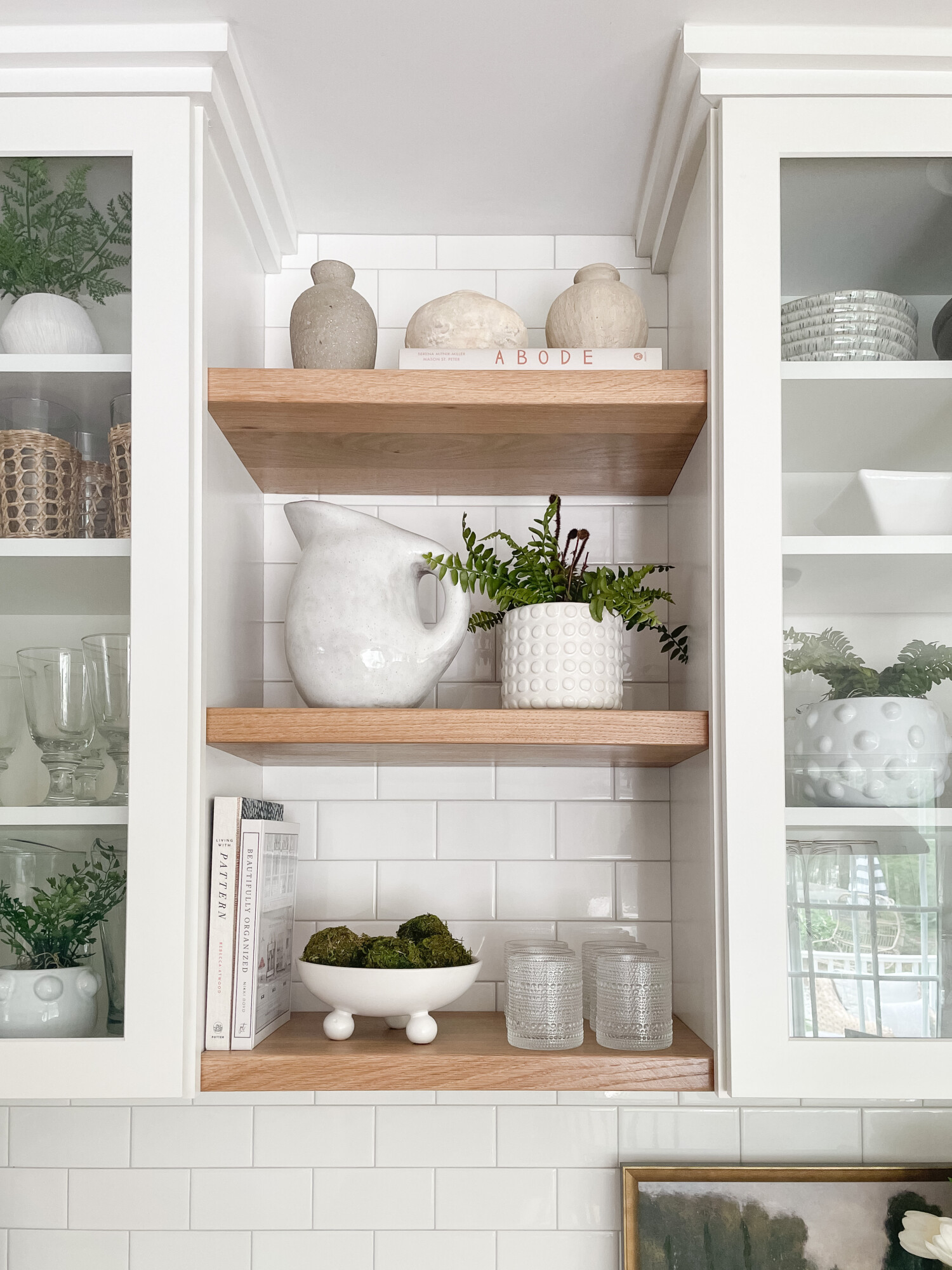
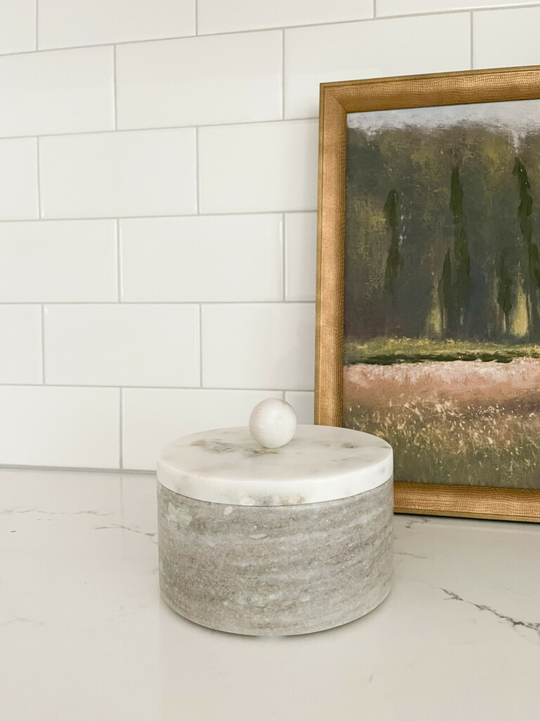
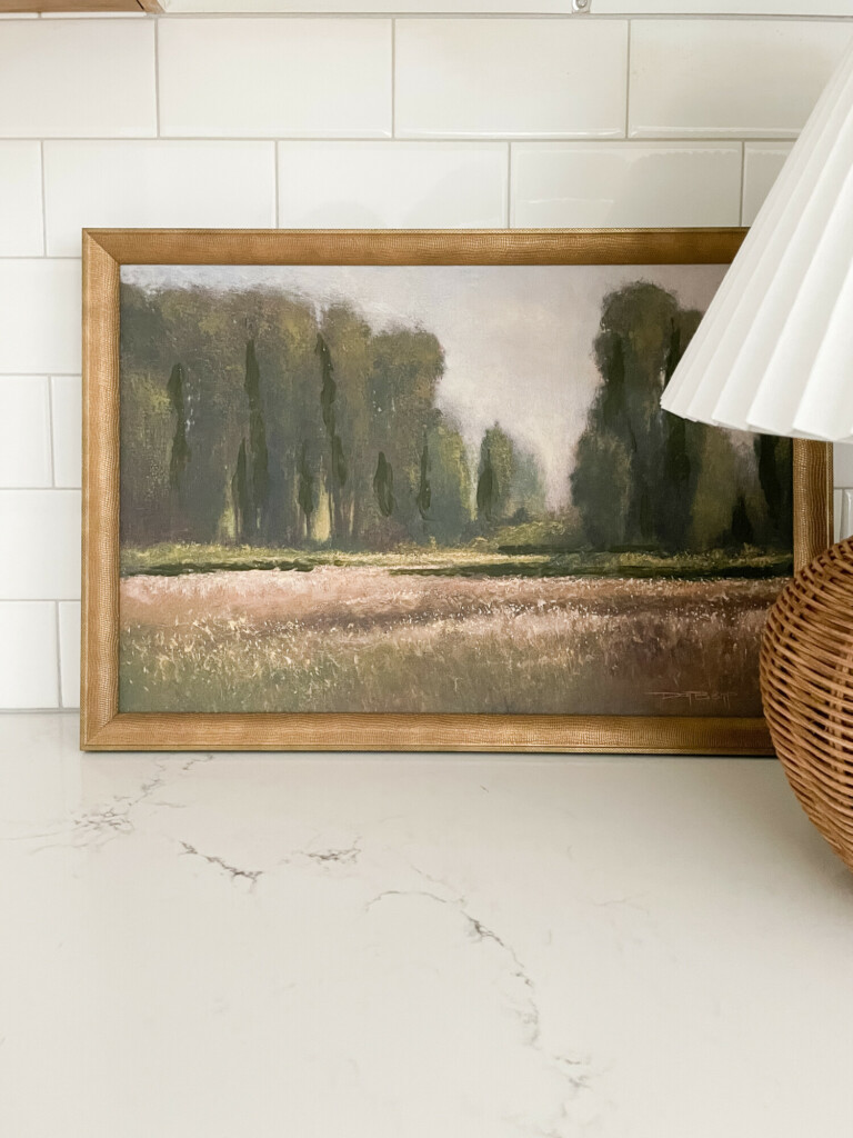
Chair | Wine Fridge | Picture | Vase | Faux Tulips | 3 Vase Set | Stone Pitcher | Glasses | Footed Bowl | Polka Dot Pot
This little beverage nook has become one of my favorite spots in the kitchen and it is NOT because that’s where the wine fridge lives! Remember, coastal home decor isn’t always about blues and seashells. Utilizing neutral tones and adding pops of green can easily achieve a coastal look! I also love using faux florals throughout my home – not only to add a touch of life to a space but they are usually super versatile.
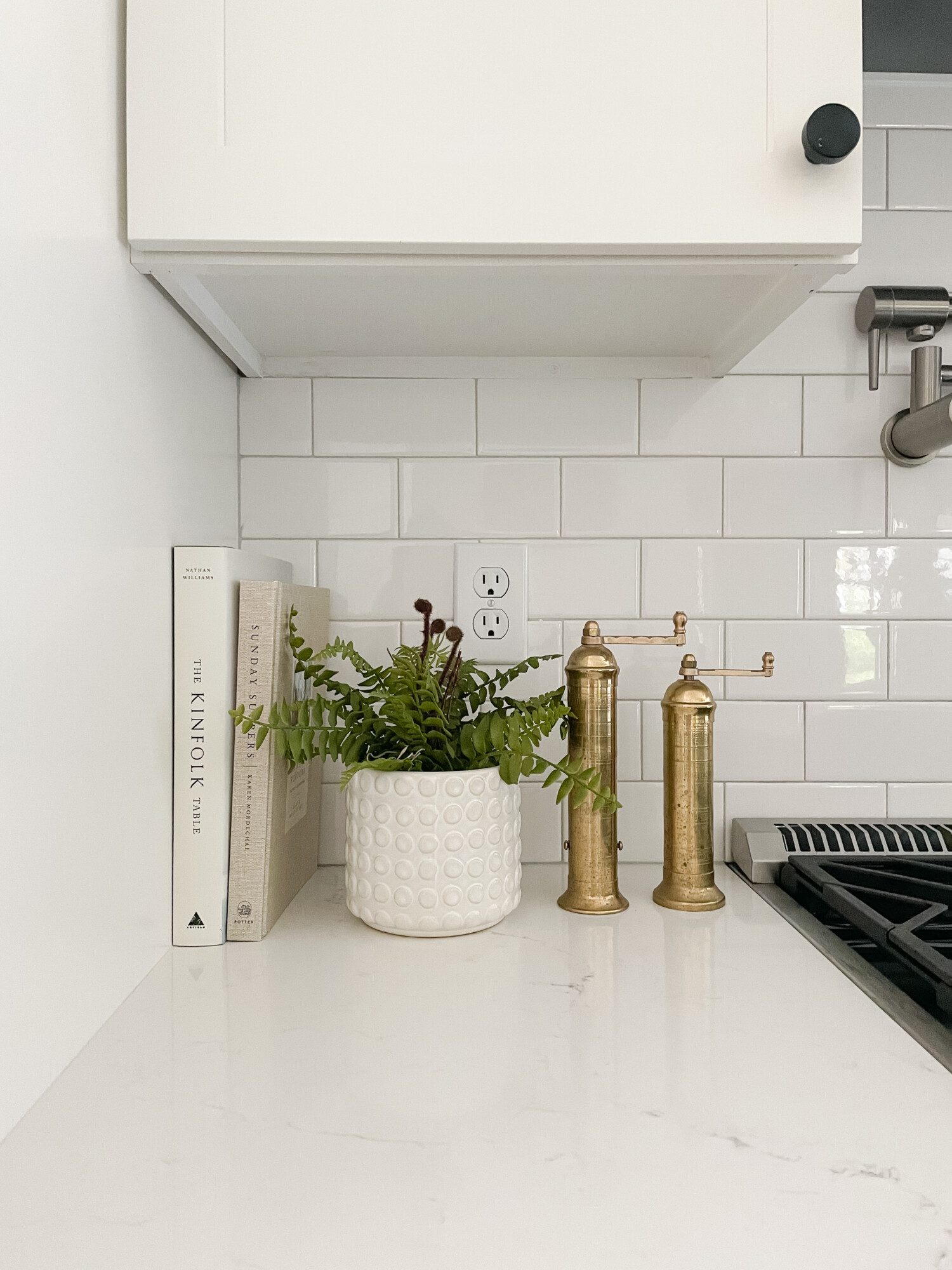
coastal counter accessories
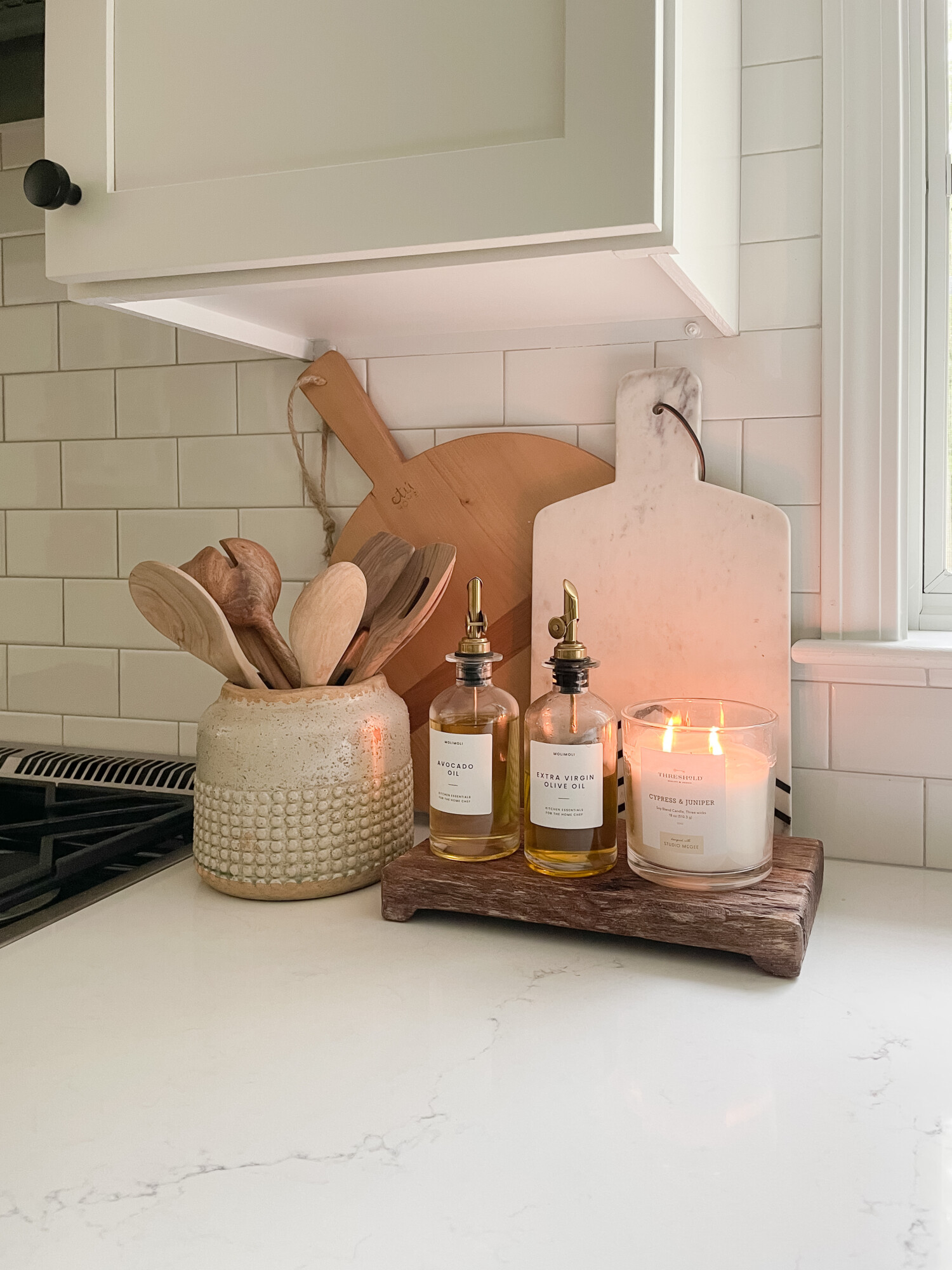
Cutting Board | Dish Holder | Utensils | Oil Dispensers | Wooden Pedestal | Candle | Cheeseboard
These kitchen accessories are perfect for filling in a small blank space. Incorporating wooden pieces into your kitchen is a great way to achieve coastal charm. The oil dispensers and utensils being readily available make for easy and convenient cooking use! Don’t forget to light your favorite candle to put the finishing touches on your kitchen’s inviting ambiance.
P.S our countertops are Pental Quartz in the color Misterio!
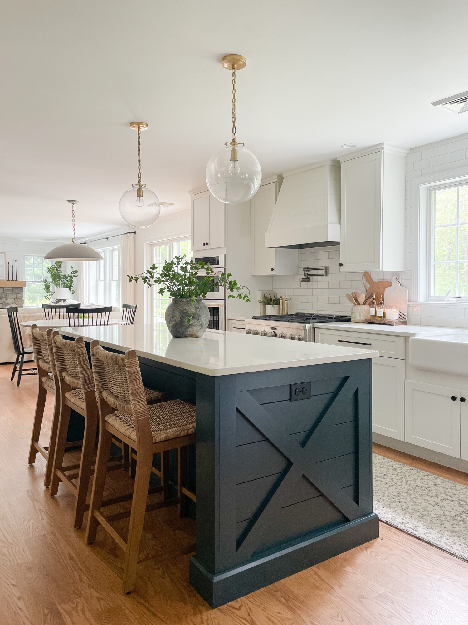
Stools | Vase | Faux Eucalyptus | Glass Pendant Light | Cutting Board
I still cannot get over our beautiful, coastal kitchen island! Choosing coastal colors for your home isn’t exactly easy but once you select a base color, you’re able to build off of it. These wood and rattan stools are another way I tied in wooden accents to the space.
Writer’s note: all of our cabinets are painted Sherwin Williams Pure White and the cabinet hardware is actually from Amazon Top Knobs!
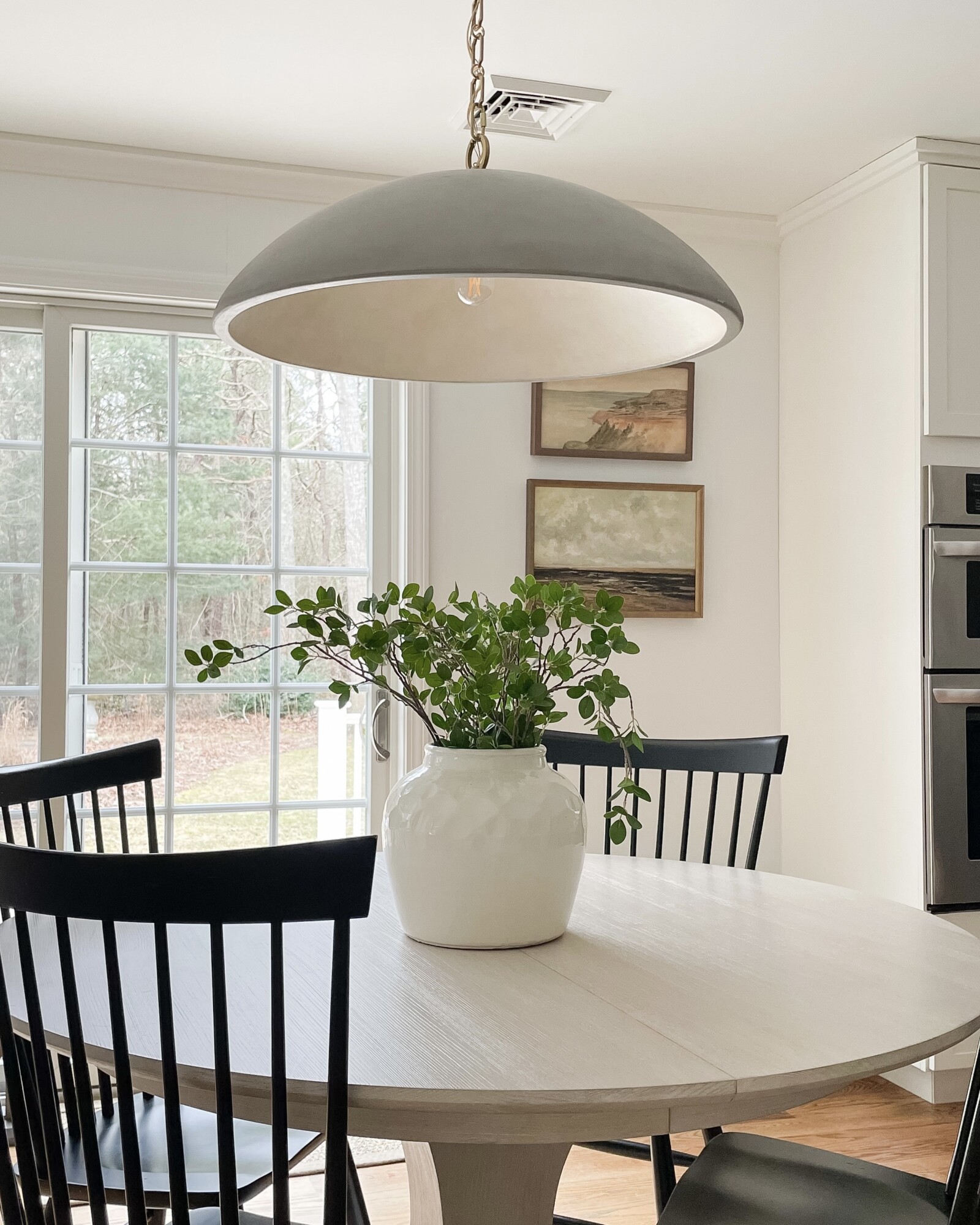
kitchen table styling
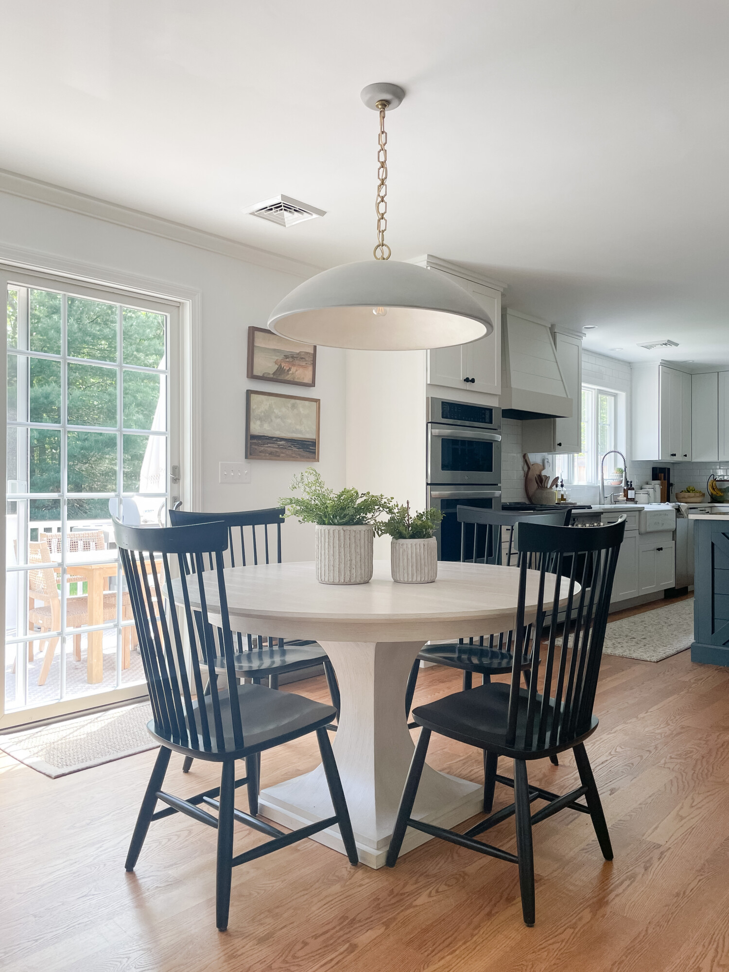
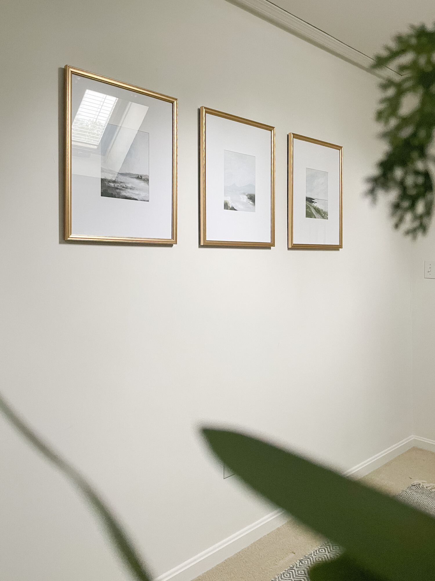
Chairs | Pendant Lighting | Faux Greenery | Wall Art (Top) | Wall Art (Bottom)
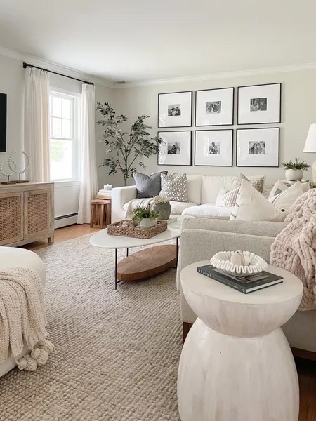
One thing I love about coastal home decor, especially for the kitchen, is that less really can be more. I kept this area’s decor minimal to give the kitchen a bigger appearance. This also helps keeps any guest’s eye on the kitchen island which tends to be the main attraction!
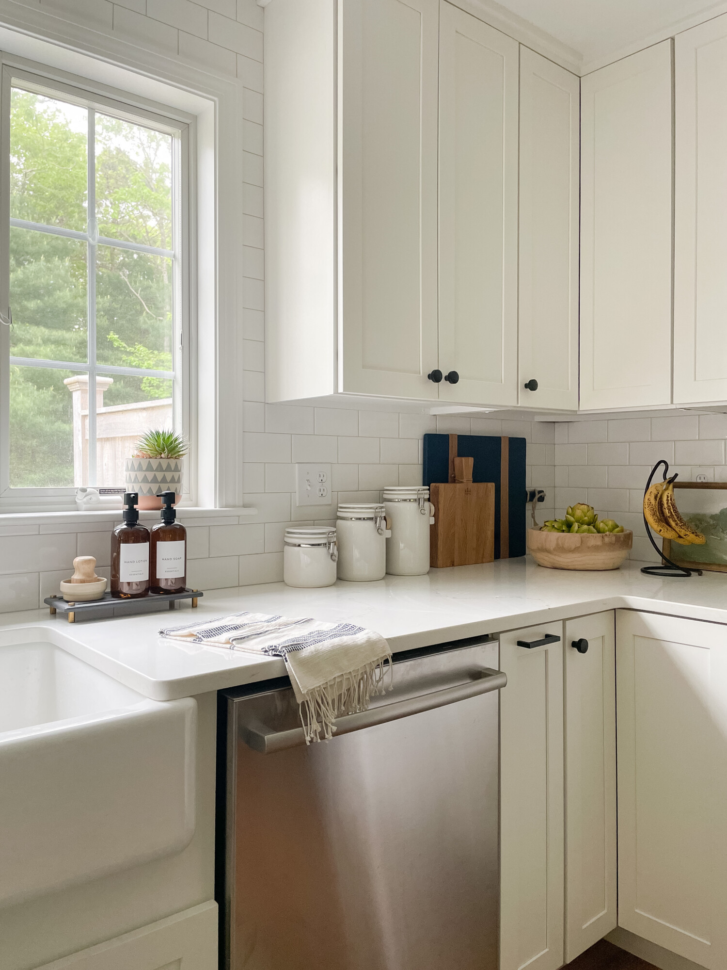
Blue Cutting Board | Small Cutting Board | Faux Fern | Polka Dot Vase | Salt & Pepper Mill | Soap Dispenser | Cookbook | Banana Hanger
Who likes a cluttered counter, especially when cooking? Absolutely no one! These minimal touches are perfect and convenient for kitchen use. I opted for wooden accent pieces and a textured neutral vase to complement the coastal kitchen look! Do you think I should add a hint of blue to this space?
Stools | Vase | Faux Eucalyptus | Glass Pendant Light | Cutting Board
Achieve a seaside feel right from your kitchen! These colors and pieces are the perfect way to feel the coastal charm right at home.
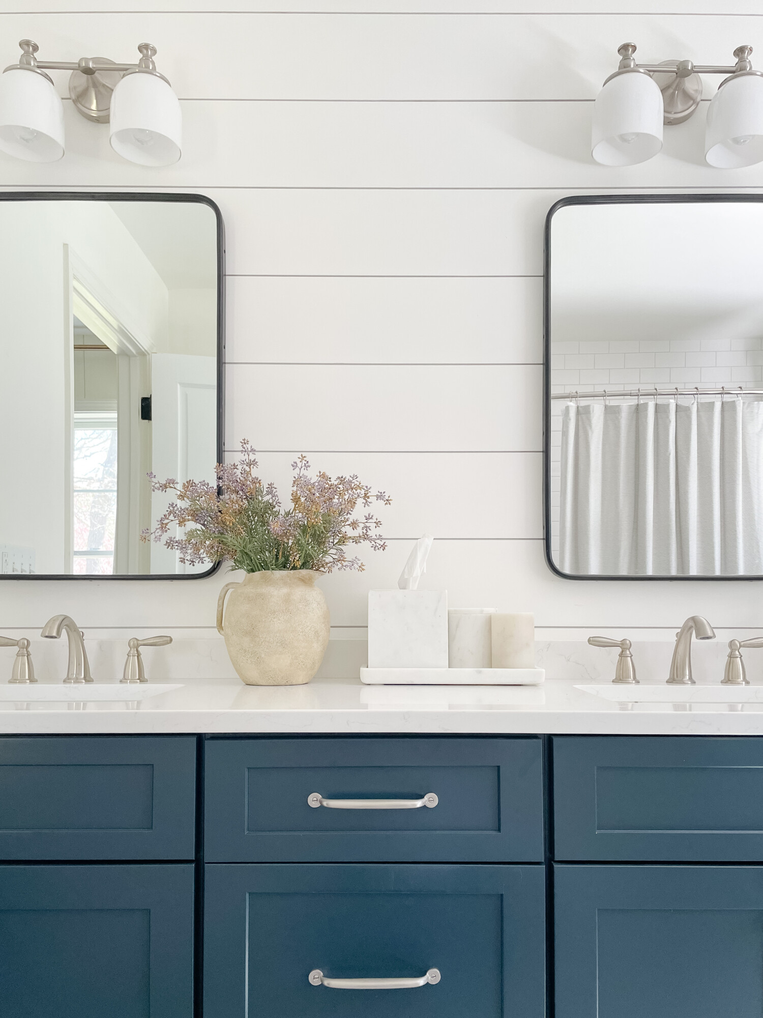
P.S: The dimensions of the kitchen are 9 x 13 and our kitchen island is 7.5’x 3’ in the color Maritime Blue – painted island by Schrock Cabinets!
To see more of my coastal home finds, click HERE!
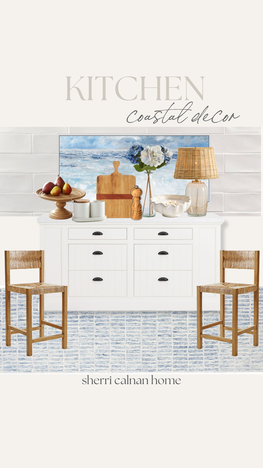
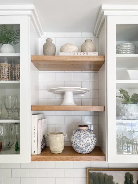
Tile | Picture | Cake Stand | Cream & Sugar Holder | Cutting Board | Salt & Pepper Grinder | Faux Flowers | Clam Candle | Lamp | Stools | Island Counter | Rug
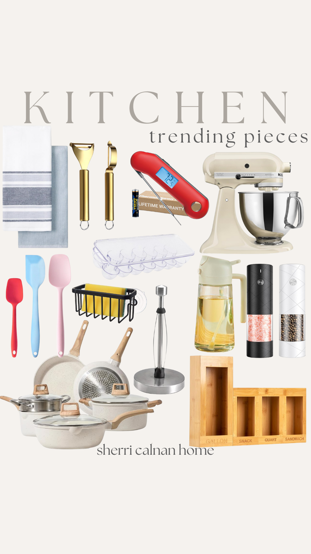
Hand Towels | Peelers | Food Thermometer | Mixer | Spatula Set | Egg Container | Sponge Holder | Oil Dispenser/Spray | Salt & Pepper Grinder | Pots & Pans | Paper Towel Holder | Ziplock Organizer
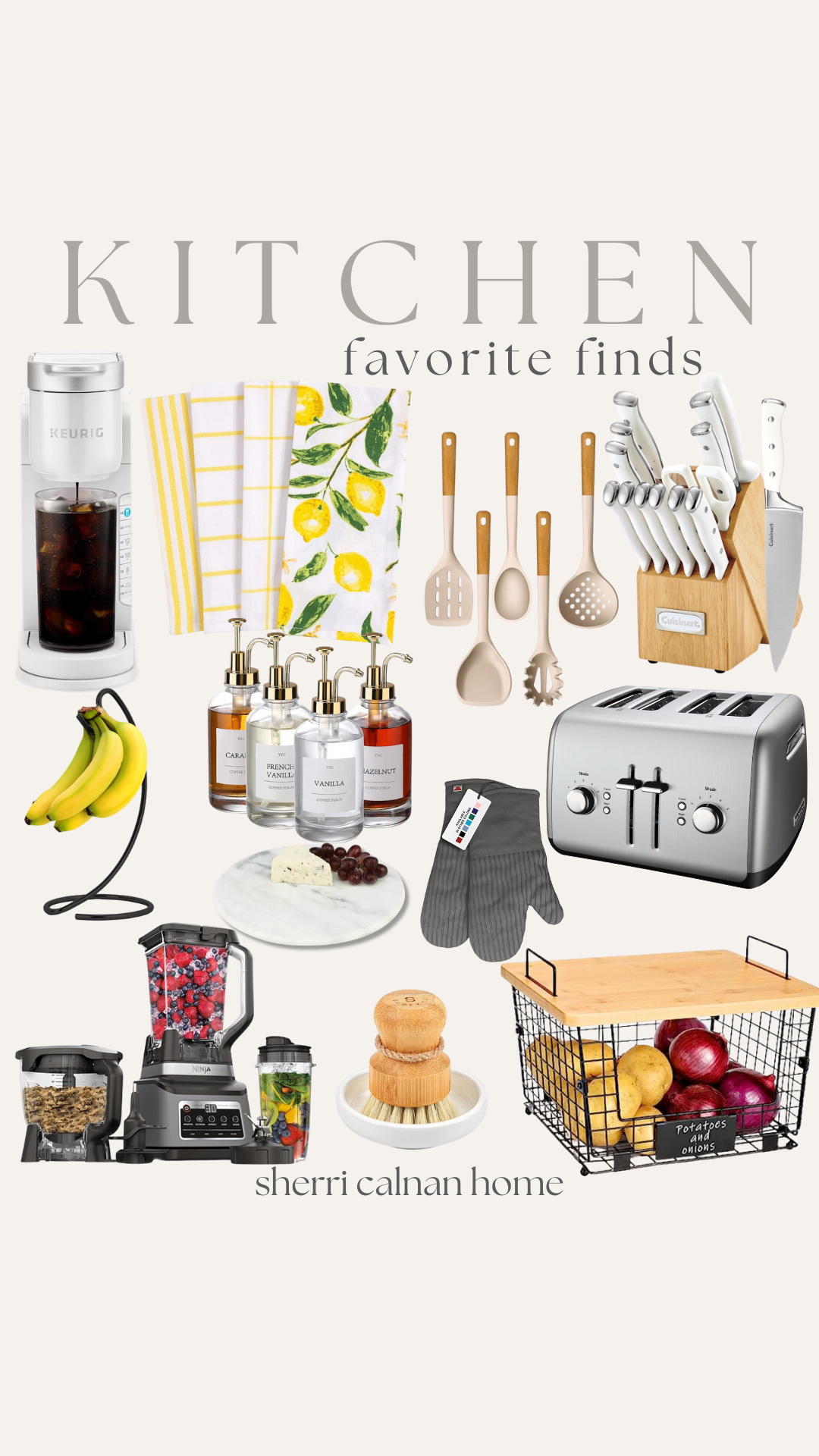
Keurig | Hand Towels | Utensils | Knife Set | Banana Hanger | Syrup Pumps | Oven Mitts | Toaster | Tray Blender | Scrub Brush


