I was so excited to show you my spring home tour, but now I’m even more excited to give you the inside scoop on each room! In my home, it’s all about those little details that make a big difference. Instead of one standout piece stealing the show, it’s the whole image that matters. I began decorating each room by incorporating colors and including dimensional pieces that kept the room neutral, yet unique. We incorporated some soft whites, subtle grays, and pops of coastal blues to set the scene. From there, it was all about textures. From throw blankets to tiled walls, navigating textures and colors for your coastal home is perfect for accentuating the overall aesthetic!
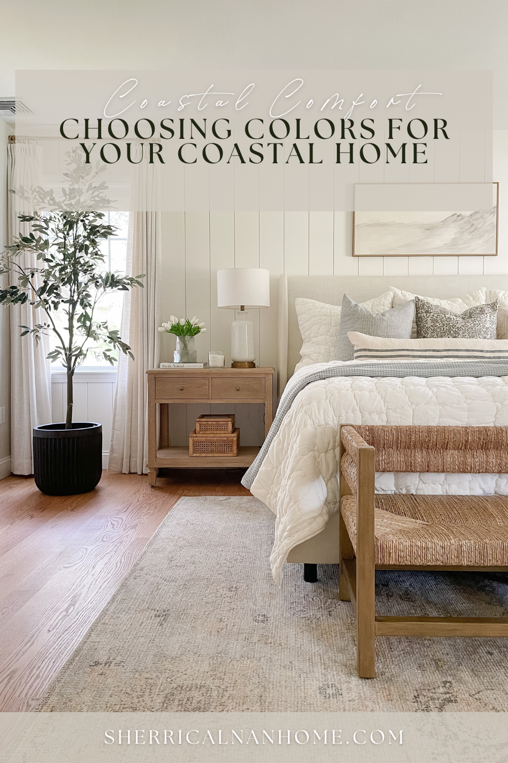
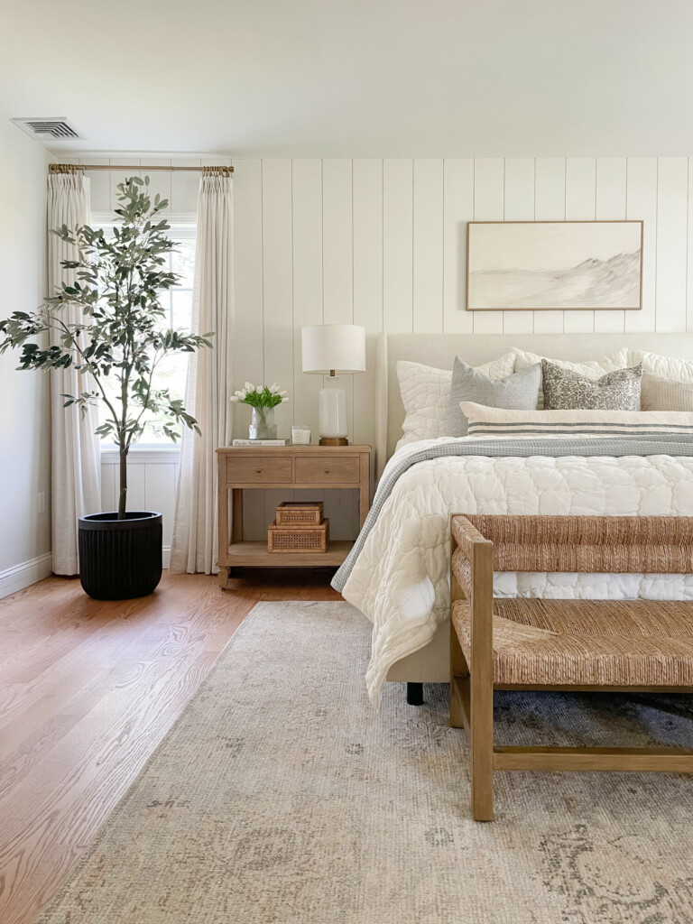
Decorative Tree | Planter | Curtains | Nightstand | Decorative Boxes | Rug | Wooven Bench | Bed Frame | Quilt | Wall Art | Blue Throw Blanket | Striped Pillow | Lumbar Pillow | Patterned Pillow
I loved enhancing every room by focusing on the intricate details that truly completed the space! Each aspect played a crucial role in achieving that fresh and cohesive atmosphere. Keep scrolling to discover how I made sure that every corner feels inviting and thoughtfully put together!
P.S our bedroom shiplap is painted BM Simply White.
Classic Grays
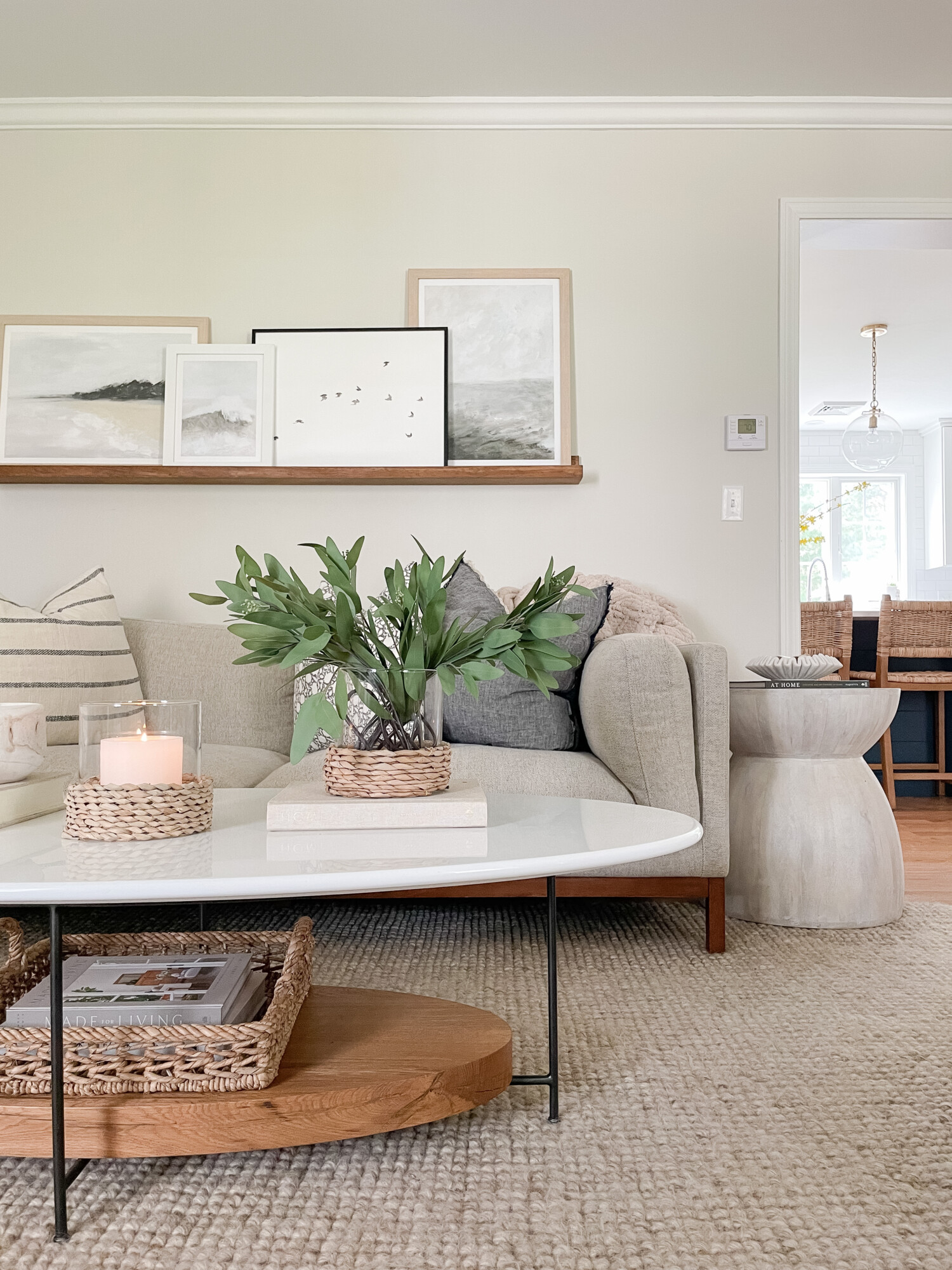
Rug | Coffee Table | Decorative Book | Art Ledge | Wood Gallery Frames | Candle Holder | Side Table | Wooven Basket | Decorative Bowl | Striped Pillow | Patterned Pillow | Fleece Pillow
When envisioning my coastal home decor, I knew I didn’t want white neutrals all over the house. Additionally, I knew I didn’t want big splashes of multiple colors either. I wanted a healthy medium between the two. That’s where my classic grays came into the picture! My living room paint is the first room you see when walking in so I wanted it to be eye-catching! The color of the walls is BM Classic Gray. I tried to match my furniture hues to this classic color to build up the room! I went with a gray-tone couch color with a stone-textured side table. These choices were not only about aesthetics; they were also about building a cohesive look that I could build on over time. By selecting items with a neutral palette and versatile textures, the room could easily adapt to any future designs or add-ons.
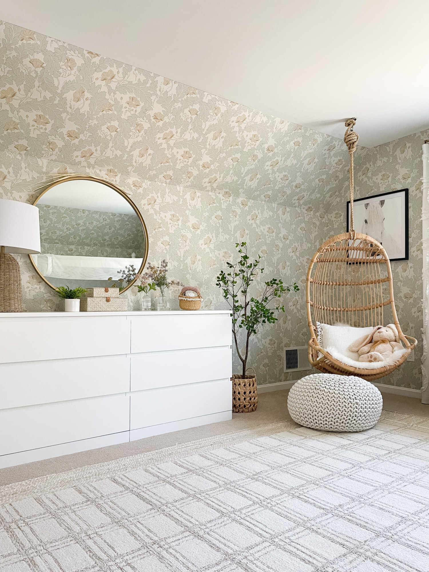
Lamp | Mirror | Dresser | Decorative Plant | Decorative Boxes | Faux Floral | Faux Floral | Planter | Swinging Chair | Plaid Rug | Solid Rug
In my daughter’s room, I opted for classic gray features as the foundation complemented by a few different detailed prints. This choice not only provided a timeless backdrop but also allowed for versatility in styling as she grows. Striking a balance between cute and feminine while maintaining neutrality was important. The patterned wallpaper served as a subtle yet captivating backdrop, adding depth to the space without overpowering it with color. A swinging chair introduced a touch of whimsy and playfulness, quickly becoming her favorite reading spot! I added in soft hints of green and light purple for extra color while still enhancing the neutral tones!
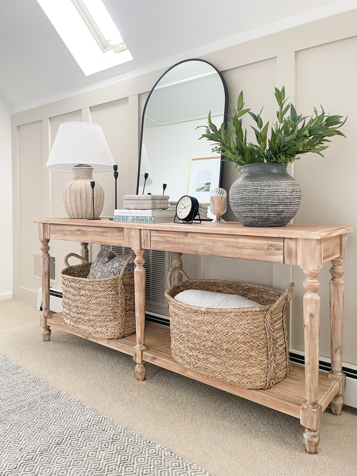
Ceramic vase | Faux willow stem | White Lamp | Arched Mirror | Candle Holders | Stone Box | Glass Matches | Patterned Pillow | Table Clock | Baskets |
To go along with my SW accessible beige board and batten walls, I chose a neutral-toned entryway table (similar linked here!) anchored by a large charcoal grey vase and white rustic lamp. These not only serve as a focal point but also add a touch of modern elegance to the space. It really creates a sophisticated look that sets the tone for the entire space. The charcoal grey adds depth and contrast, while the neutral tones of the table and decor provide a timeless backdrop. Together, they strike the perfect balance between contemporary flair and classic charm. Additionally, I added woven baskets to brighten up the neutral tones, but also provide convenience to the space. It’s nice to have pieces that add purpose as well as style!
Simple Whites
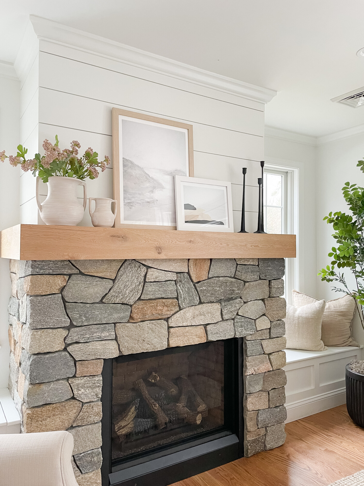
White vase | Candle Holders | Wall Art | | Linen Pillow | Faux Tree | Planter | Faux Floral
In my home, we have these textured white painted walls, in SW Pure White, that I wanted to embrace when creating a style. Parts of these walls are solid white while others, like the one above my mantle, have a tiling pattern. This made it really easy, but exciting to curate a space that exudes tranquility and sophistication. On my fireplace mantle, I added white accents that effortlessly elevate the space. From ceramic vases to framed artwork, each piece adds dimension while maintaining a cohesive aesthetic with the white walls. This subtle interplay of shades creates a serene and inviting atmosphere, where every piece feels purposeful and refined. To me, this space emphasizes the beauty of simplicity, where even the simplest solid white can make a statement!
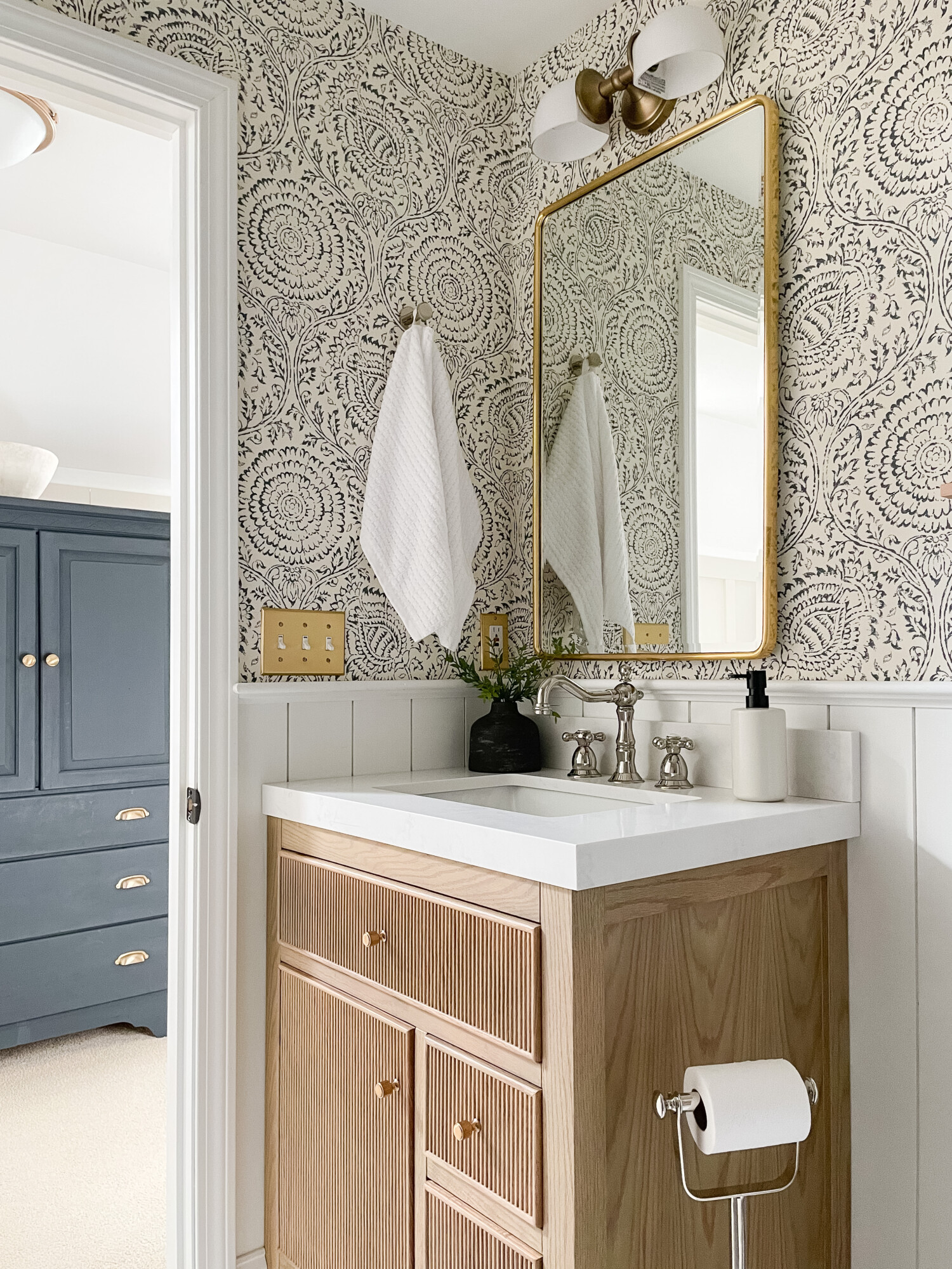
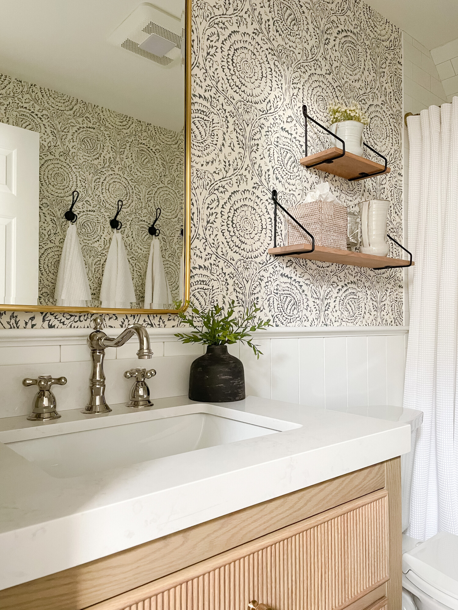
Faucet | Light Switch Cover | Towel Hooks | White Towels | Light Fixture | Gold Mirror | Soap Dispenser | Wooden Shelves | Tissue Box Cover | Vases | Shower Rod | Shower Curtain | Wall Paper
In my kids’ bathroom, I opted for a timeless color scheme that combines style and functionality. The focal point of the room is undoubtedly the wallpaper with the chic blue and white geometric pattern. I loved how it added visual interest and depth to the space! This bold choice sets the tone for the entire room, infusing it with a modern yet playful vibe. To complement the wallpaper, I incorporated little accents throughout the room like my neutral wooden shelves with black wiring that matched perfectly with my black towel hooks. These subtle touches not only enhanced the overall aesthetic but also provide practical storage solutions for keeping the space organized!
Statement Blues
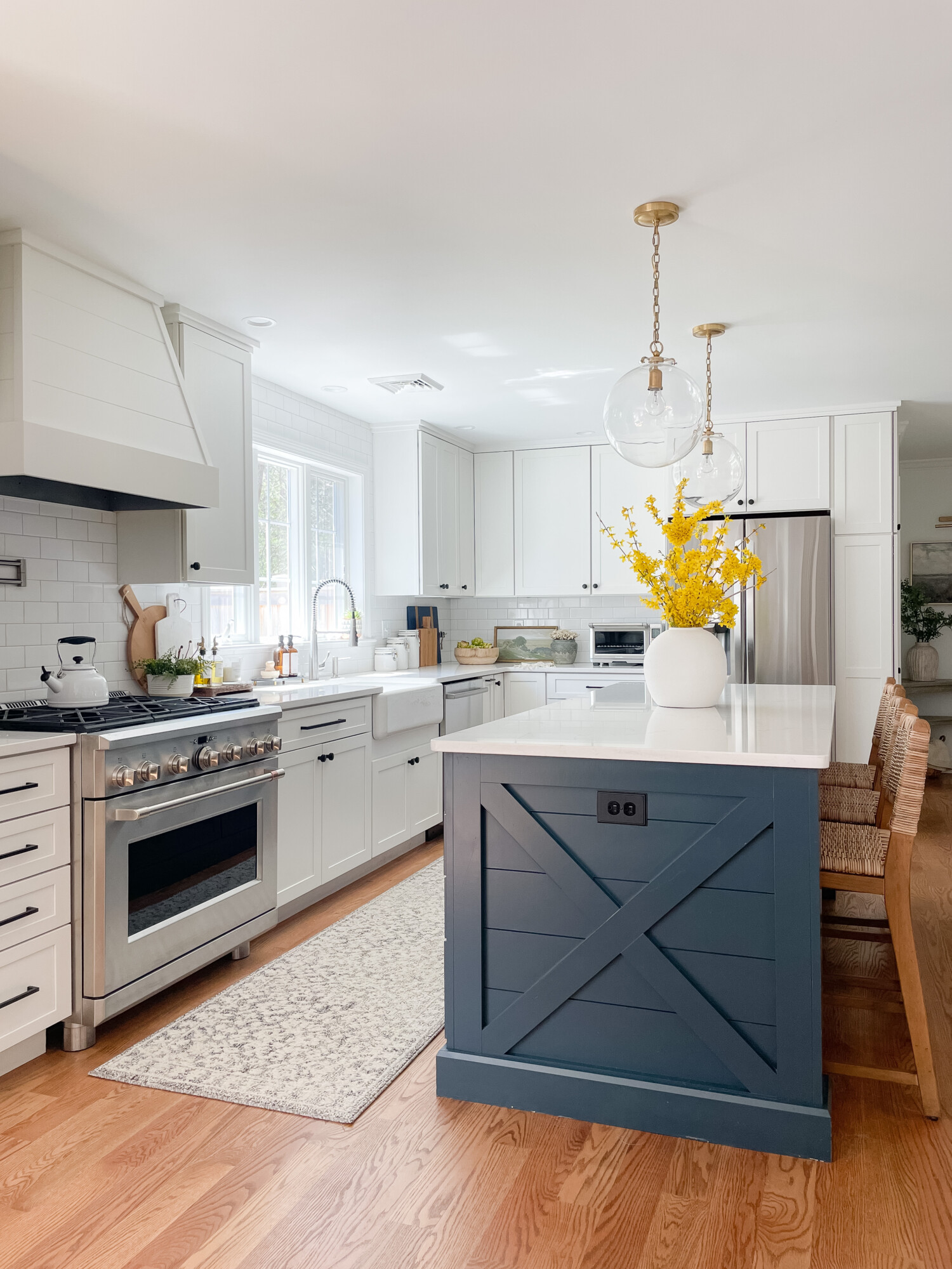
White Vase | Light Fixtures | Soap Bottles | Soap Dispenser | Gold Salt Dispenser | Knife Set | Oil Dispenser | Rug Runner | Ceramic Vase | Backroads Painting
In my kitchen, the design revolves around a striking statement: the Maritime Blue-painted island by Schrock Cabinets! Against the SW Pure White-Painted cabinetry and light wood floors, the island stands out as a bold focal point. I wanted the room to have extra contrast to the white cabinets, but still keep its bright energy. The vibrant blue adds a pop of color to an otherwise neutral palette. To further enhance the cohesive look, I’ve incorporated subtle accents throughout the kitchen, like my gold light fixtures and my subtle blue rug runner. I loved adding these touches because they not only complement the island but also tie the entire space together! With its blend of modern sophistication and cozy warmth, my kitchen is a true reflection of my style and personality!
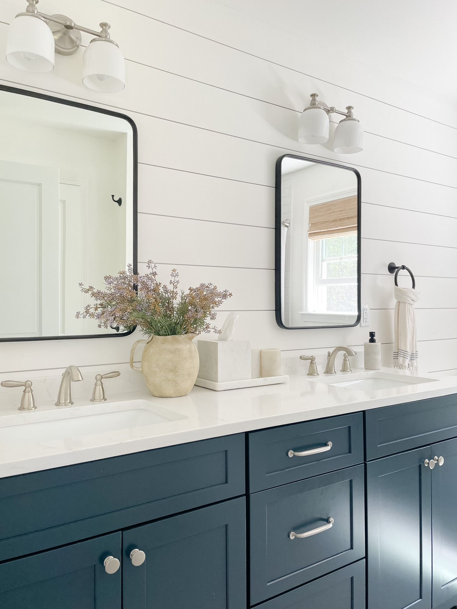
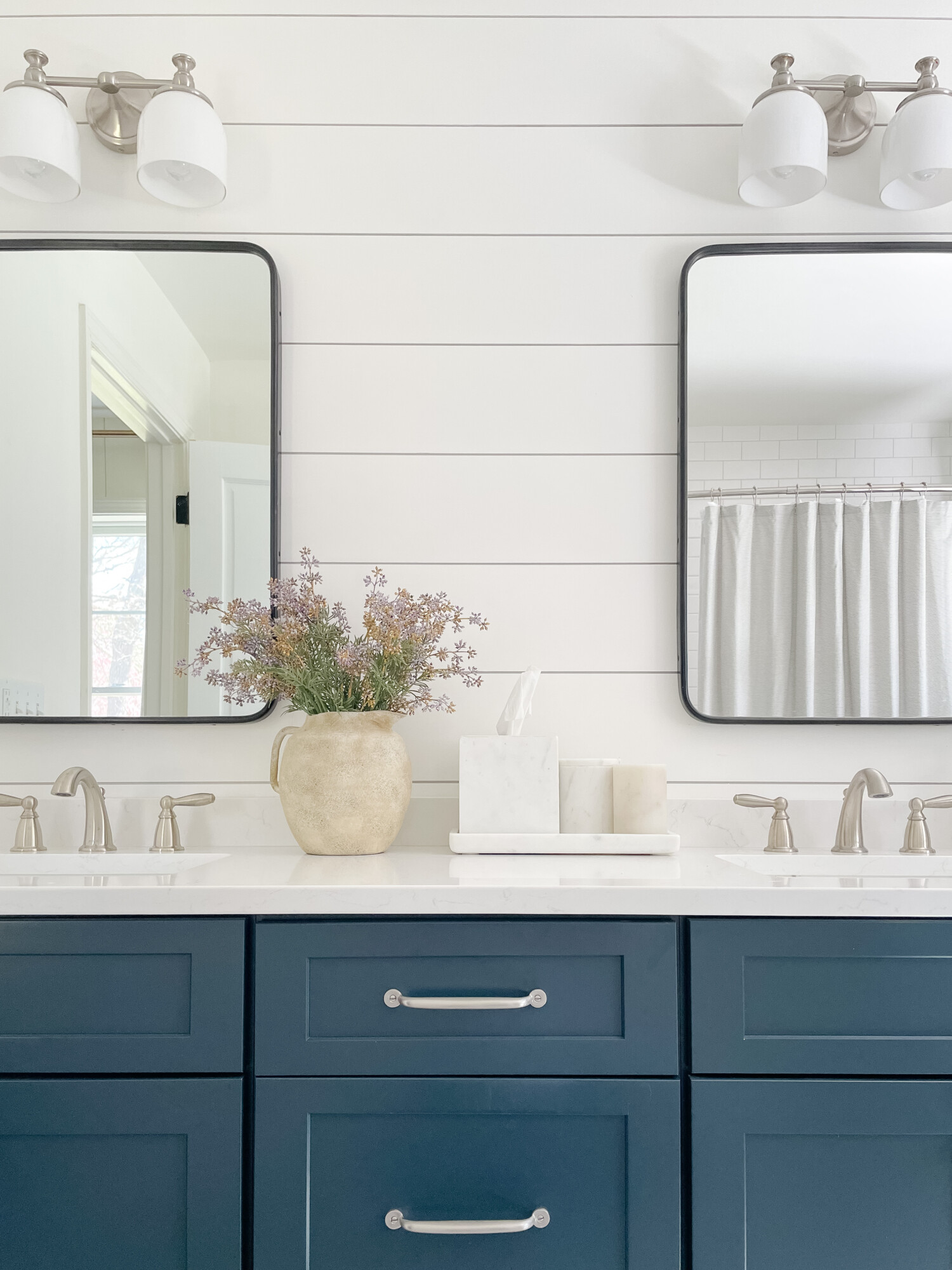
Mirrors | Planter | Faux Floral | Silver Knobs | Drawer Pull | Marble Bathroom Accessories | Light Fixture | Shower Curtain
Similarly to my kitchen, in our master bathroom, I wanted a splash of color and personality in the space! Bathrooms can sometimes be neglected because they are typically a room you go in and out of. I wanted it to blend and feel as nice as the rest of the home. The shiplap walls are painted BM simply white. Against these white walls and sleek fixtures, I added in blue cabinets to stand out as a vibrant, eye-catching feature. To complement this bold choice, I’ve opted for black-rimmed mirrors, adding a touch of contrast and sophistication to the room. I created a combination of blue cabinets and silver accents to create such a modern and stylish aesthetic. With its blend of bold colors and sleek design elements, my bathroom is a room where style meets functionality. It provides the perfect place for relaxation and rejuvenation!
Writer’s note: all of the trim in our home is SW Pure White!
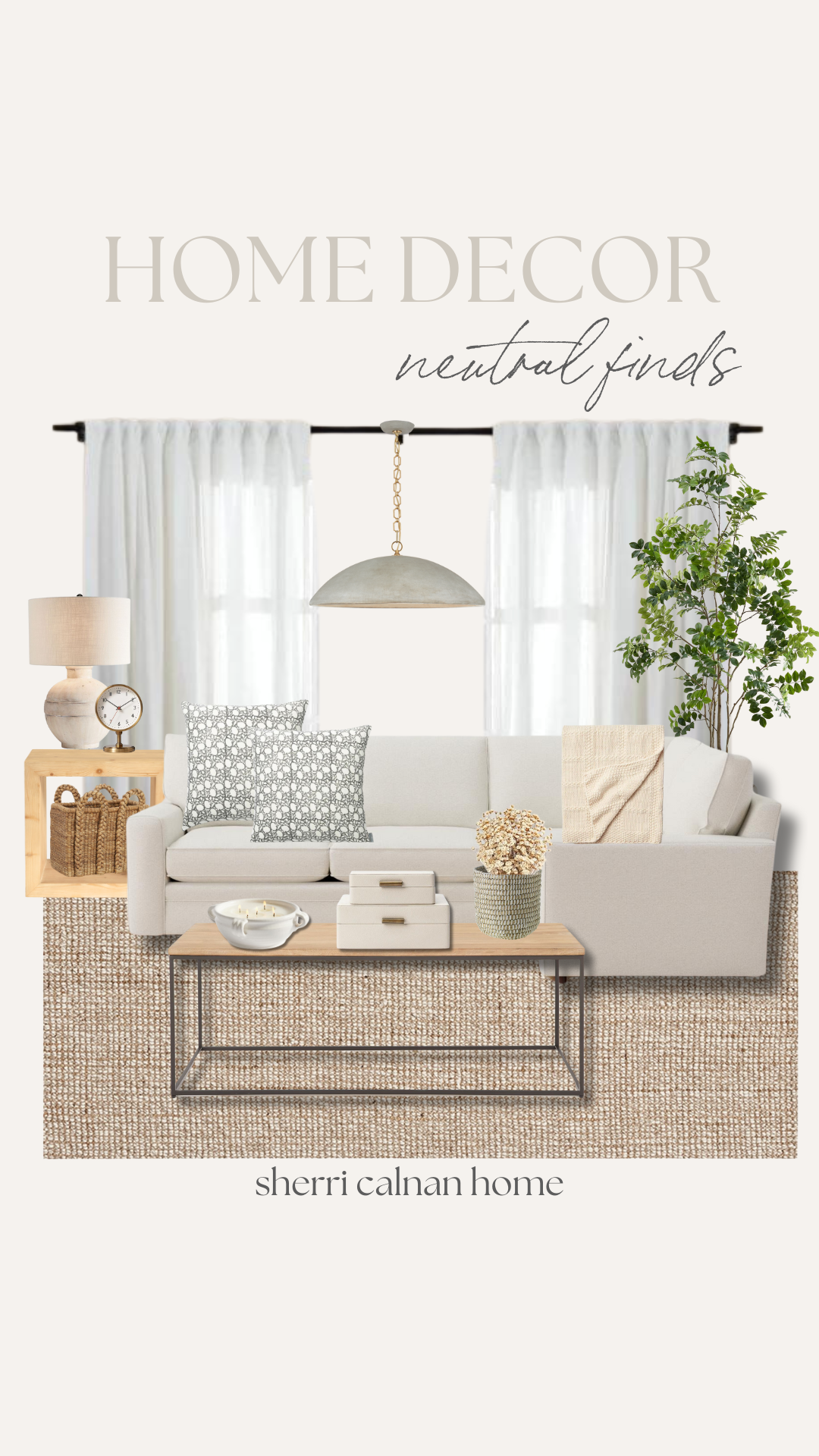
Rug | Coffee Table | Candle | Decorative Boxes | Planter | Faux Floral | Couch | Blanket | Pillows | Faux Tree | Curtains | Light Fixture | Side Table | Clock | Basket | Table Lamp
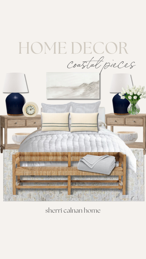
Rug | Bench | Throw Blanket | Quilt | Bed Frame | Striped Throw Pillows | Patterned Throw Pillows | Side Tables | Decorative Bowl | Lamp | Clock | Faux Tulips | Wall Decor
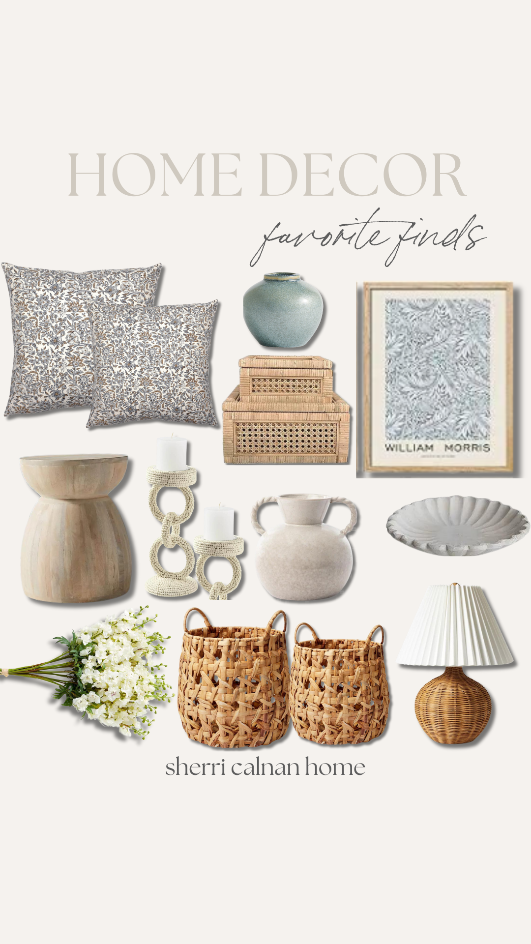
Patterned Pillows | Blue Vase | Decorative Boxes | Wall Art | Side Table | Candle Holders | Vase | Textured Plate | Florals | Baskets | Wicker Lamp




2 thoughts on “Choosing Colors For Your Coastal Home”